"Median" age means half of workers are older than 42.40 years of age and half are under (read that on the RIGHT SCALE).
The percent of the population that is over 65 is 14.2% (LEFT SCALE).
Both these numbers are all time highs, as you can see.
During the late 50's and part of the 60's we had a high in median age just a year or so below the current one but the percent of the population over 65 was significantly less (assumption--the graph does not show it).
So, we have an increasingly aging workforce taking care (in terms of entitlements) of an increasingly aging population.
Not sure my back can take it and my feet really hurt. Hope we start trending young again sometime soon.
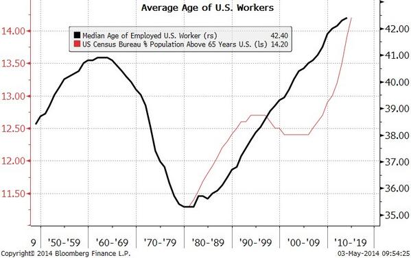 |
| Source: Twitter via Michael McDonough |
No comments:
Post a Comment